Big and bold visuals

Visuals front and center
On many online marketplace platforms we noticed that sellers were taking to using text to describe their stories.
We couldn’t blame them. With large text fields and spaces for text in the interface design, it is easy to see why sellers would assume to use them to communicate their stories.

UI Design
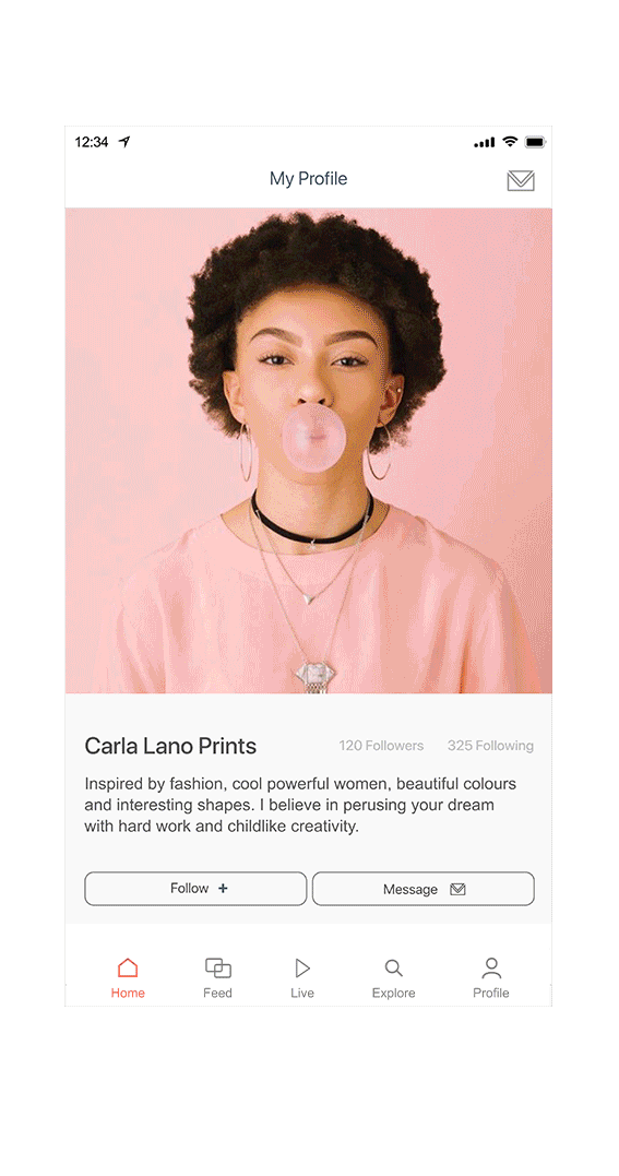
We wanted to create an interface that would prioritise visuals, as a way to prompt sellers to pay more thought into their visuals.
Text fields were made smaller to serve to supplement the visual and not to be the main content.

Images take majority of the space on the card, giving them greater visual hierarchy in the interface design.
Before: Content is presented through long strings of text

After: Breaking down the content into cards with visuals
These changes help sellers communicate with their buyers in more engaging ways, and keeps buyers interested in finding out more.
The Transformation
Using Carla's About page on Etsy to show a before and after comparison of how the page would look like after it was adapted into our new system.
Up next


